
Inspired by this Home in South Orange, NJ

When I saw this home on Architectural Digest designed by Jenny J Norris, I oozed over every image. It's kind of like the epitome of my personal style. The juxtaposition of the darks and the lights, the soft and the hard, the feminine and the masculine, the old and new... the list goes on.
It was definitely worth a re-share on my blog. To put a spin on the Arch Digest feature I wanted to speak towards the few details and decisions that Norris made which really show through in making this home the beautiful art piece that it is.
Color Palette

Design by Jenny J Norris | photography by GENEVIEVE GARRUPPO


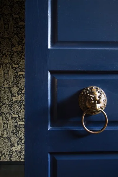
One thing that stood out immediately to me, is how Norris chose classic colors yet combined them to create a less common palette, and uses them in a unique execution, which is consistent throughout the entire property.
She pairs black and dark blue, mustard, chartreuse, soft greys, and off-whites. In different rooms the moldings are painted high gloss black, and in the instance of the living room, the moldings are the same color as the walls in the deep dark blue. The mustard comes through in the wall coverings but also is interpreted in the metallic brass fixtures and furnishings. The chartreuse is seen in the textiles and rug in the dining room. The mural wallpaper outside the living room holds almost all of the colors, and could in a sense be the mood board for the entire home.
Chinoiserie
from a different perspective

Design by Jenny J Norris | photography by GENEVIEVE GARRUPPO
How often do we see Chinoiserie design elements utilized within interiors that are bright, colorful and cheery. I'm definitely a fan of the brights but in this home, the use of Chinoiserie is so refreshing. It expresses a more worldly and cultured view than that of the typical British or French interpretation of the flowery, pretty Chinoiserie. Though, all Chinoiserie is an interpretation and mostly an incorrect interpretation of real Chinese style - which is the definition of it. These prints and patterns, when used in the dark and moody color scheme make it feel more authentic.


HIGH / LOW

Design by Jenny J Norris | photography by GENEVIEVE GARRUPPO


One thing I also love about this project is that there are several items and pieces that are sourced from mainstream retail stores. Yet, it all looks very high-end and luxurious. This is just gives us another instance where to obtain an elevated design, you do not necessarily have to use the most expensive or custom, luxury items. A few example items that I recognize that aren't "luxury" are: the daybed in the library is from CB2, the bed in the children's room is from RH child, the bed in the master is the exact same bed that I currently own, and the bedside tables in the master also look to be from Anthropologie. So how does this whole space look so elevated? Well they've splurged on the more permanent elements - the wall coverings are not inexpensive (but they're used them smartly by creating accent walls), the rugs look to be of nice quality and the real deal - no polyester, and lighting looks like it's all from trade sources.

Design by Jenny J Norris | photography by GENEVIEVE GARRUPPO
HIGHLIGHT ANTIQUE + GATHERED TREASURES

Design by Jenny J Norris | photography by GENEVIEVE GARRUPPO
The final detail that I recognized and actually may even be the most important detail is that they've decorated with a ton of globally sourced items and vintage pieces. The decorative objects and artwork have a very cool and collected vibe that enlightens us as the viewers to think this couple is well traveled, and has a worldly perspective. I especially love how they've framed the ornate Spanish Bolero Jacket (at least that's what I think it is). There's a quote that I am reminded of by Jan Showers, "Every room needs a touch of black just as it needs at least one antique." This home certainly makes a case for that.

Design by Jenny J Norris | photography by GENEVIEVE GARRUPPO


Design by Jenny J Norris | photography by GENEVIEVE GARRUPPO
You can see the complete tour on Architectural Digest as well as through Norris' website.
All images are from Architectural Digest and www.JennyJNorris.com


