
Cream + White Rooms, Designing Serene Spaces

We have a client who specifically asked for their bedroom to only be in shades of cream and white. At first I was hesitant, because I personally love color and contrast, but this challenge soon made we warm up to the idea of a soothing tone-on-tone master suite.

A few of the swatches we pulled for this project | Lauren L Caron © 2017
As with all design, we want to create spaces that are interesting with a sense of depth to them. White and cream rooms can be very flat, however if focus is set on the subtle details, you can create a space that is both soothing and serene.
PATTERNS + TEXTURE
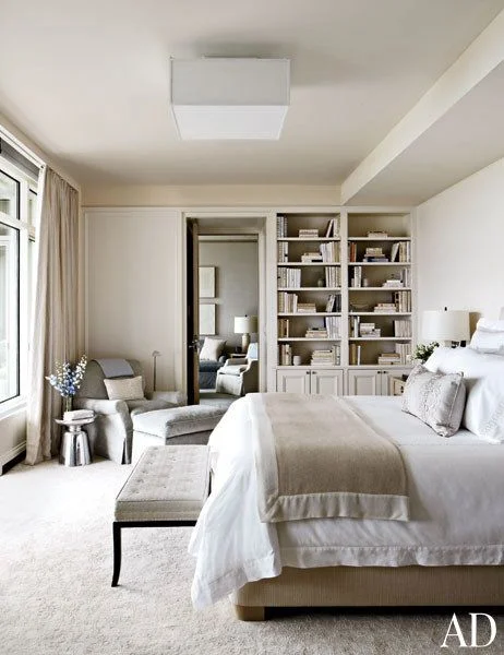
When a space is tonal you can add design depth by using tone-on-tone patterns or focusing on texture. In this room, designed by Victoria Hagan there is minimal pattern. I'm only seeing tonal patterns on the bed dressings, yet it still works together and the room doesn't lack interest. What this room does have is vast amount of texture. All of the furniture, and textiles are varied in texture - the plush carpet, the woven bench, the throw looks to be the softest cashmere, and the velvet chair in the corner is paired with a glossy hard surface stool create balance.

WEIGHT
In order to feel soothing or serene, there must be some sense of grounded-ness. Meaning there should be something grounding the room, such as a sufficiently larger area rug that gives (most of, if not all) the furniture a place to rest. Additionally, if you bring at least one dark element into the space, it will help to make the other items and elements feel lighter. It will create contrast and provide a sense of context for the lighter items. You can see in this room design by Shelton, Mindel & Associates that the arms and legs of the chair are the only dark elements.

COLOR
Just because you're working in the same general color palette doesn't mean there aren't different shades within it. I would recommend defining a certain value scale and to resource within that scale. This is really where focusing on the subtle differences creates a major impact. In this bedroom on a basic level, that room is off-white. However, if you really break it apart, there are at least 10 different shades of white!
UTILIZE CLEAR OR MIRRORED FINISHES
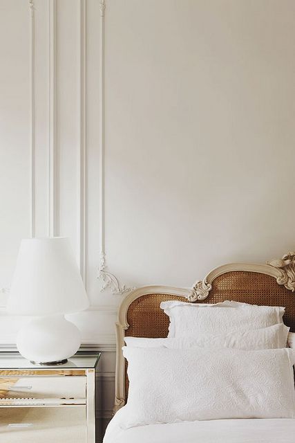
One more element that can help tie together a space of all whites and creams is to bring in objects that are clear or mirrored. In this Chelsea London room photographed by Jason Busch, the nightstand is mirrored and virtually disappears, reflecting the surrounding fixtures. It is a long standing fact that reflection will bring light into the space, but also objects that are clear will enhance the feeling of serenity.
A few more room examples...


I'm excited to share the finished product of our project with you in the coming months. I believe we settled on some beautiful textiles and accessories to make the space sing. Looking through these images do you think I've missed anything major? I'd love to know.
Sources:
Main Header Image - Betsy Brown


