
Incorporating the Principles of Visual Design into Interiors

The basic principles of visual design are balance, proportion, rhythm, emphasis, and unity. Although often overlooked, much like 2D visual art and design, quality interior design follows the same principles. I've compiled some of my favorite rooms as examples to show how each principle is represented in this field of design.
BALANCE
Balance can be represented in the layout of a room, which refers to symmetry and weight within a space, in the shapes of the furniture, (i.e. curves and angles) as well as within the balance of color and contrast. The easiest way to make a room feel balanced overall is within the symmetrical or formal balance, when the elements are arranged equally or on either side of a central axis, the result is bilateral symmetry. There is a variant of symmetrical balance called approximate symmetry, in which equivalent but not identical forms are arranged to create a feeling of balance. This is probably the most common instance of symmetry within interiors, because it's more interesting than exact symmetry.
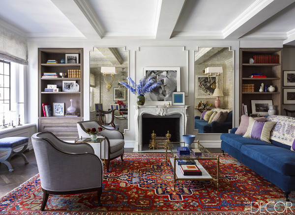
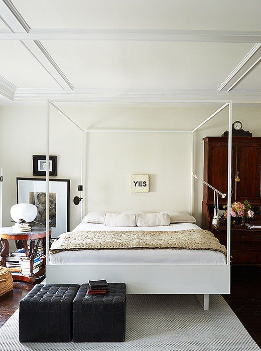
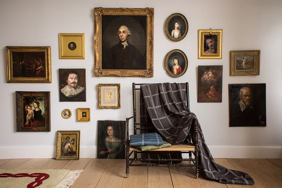
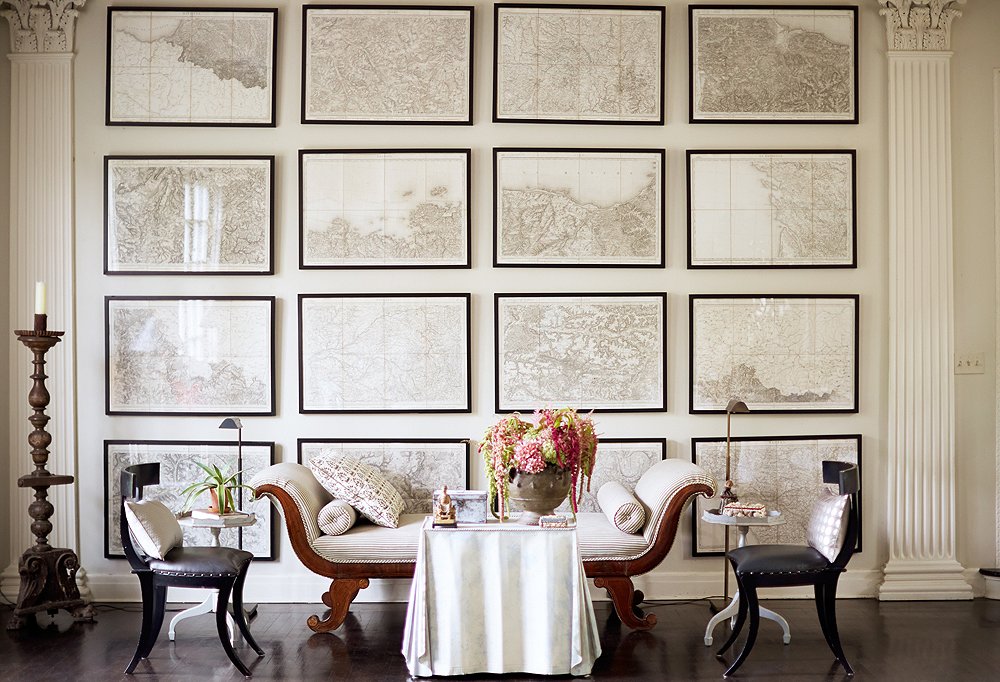
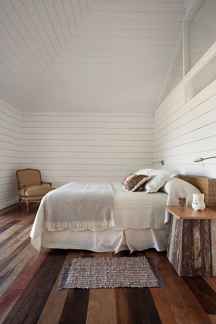
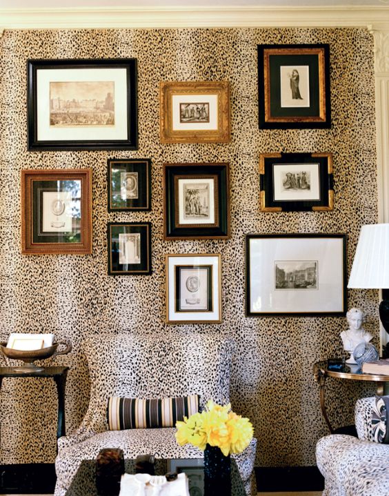
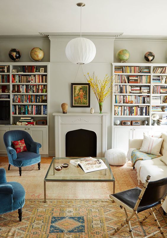
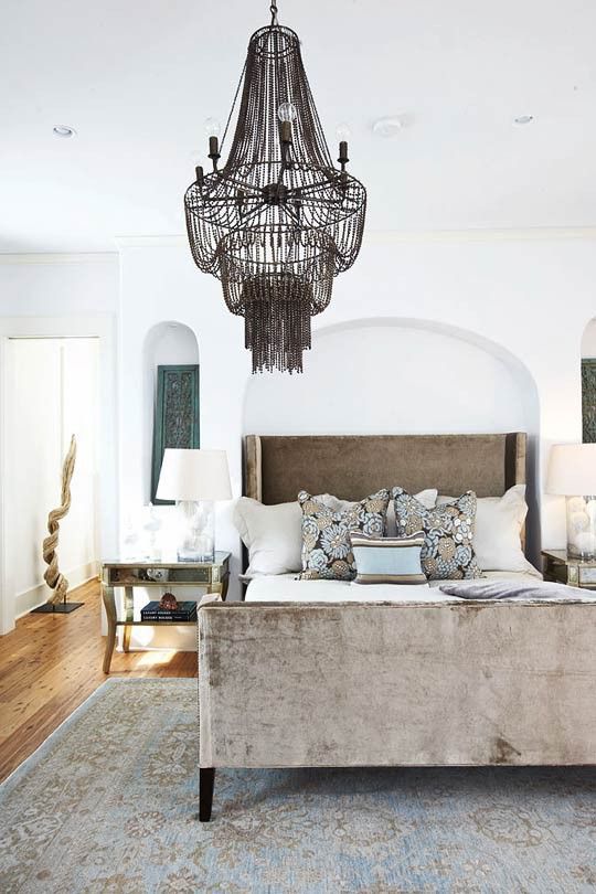
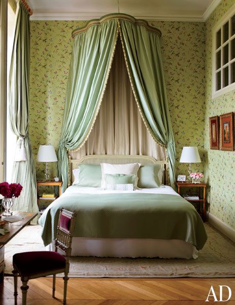
Asymmetrical balance, also called informal balance, is more complex. It involves placement of objects in a way that will allow objects of varying visual weight to balance one another around a fulcrum point (a fulcrum is a pivot point around which a lever turns, or something that plays a central role in or is in the center of a situation or activity). This can be best imagined by envisioning a literal balance scale that can represent the visual "weights" on a scale. For example, it is possible to balance a heavy weight with a cluster of lighter weights on equal sides of a fulcrum; in the 1st picture above, this might be how the two chairs balance out the visual weight of the blue sofa. Or in how in the bedroom, the height and color depth of the armoire balance the cluster of furniture, accessories and artwork on the left side of the fulcrum point, which in this case is the YES print. It is also possible to imagine objects of equal weight but different mass (such as a large mass of pillows versus a small mass of books) on equal sides of a fulcrum. Unequal weights can even be balanced by shifting the fulcrum point on our imaginary scale, such as shown in the gallery wall image with the chair slightly shifted off center.
RHYTHM
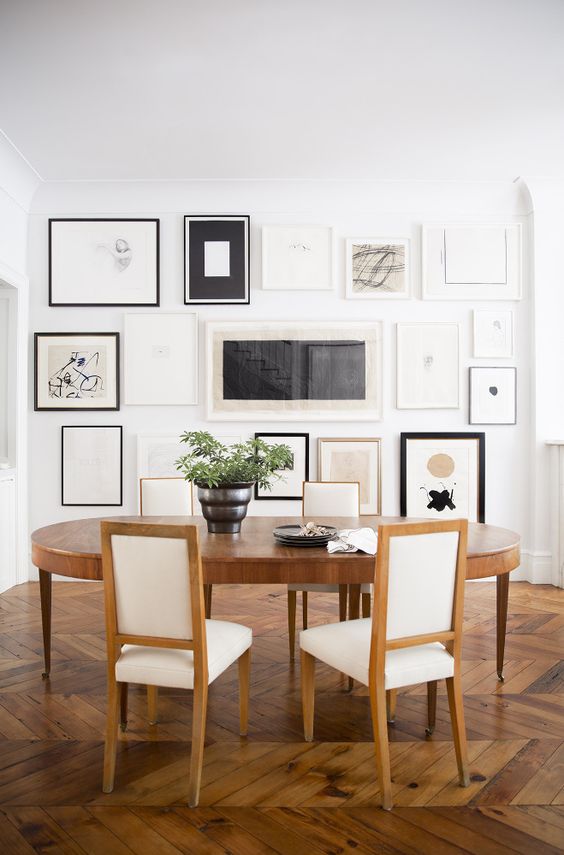
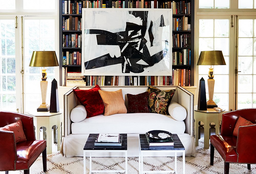
Rhythm refers to pattern and line. With 3D spatial designs, you use pattern in the textiles, wallpaper or carpeting, or depict line through molding, paneling, flooring, as well as through the shapes of the furniture and accessories. Also, styling can come into play when you factor in rhythm. For example, the room above with the bookshelves has a relaxed rhythm that is visible through the way the books are set. In the other spaces, the placement of the pictures and the setting of the pillows creates a sort of rhythm.
EMPHASIS
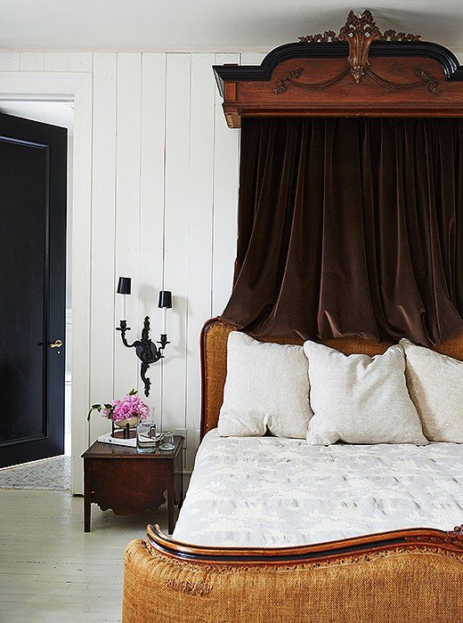
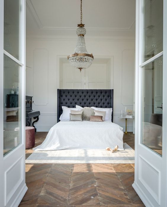
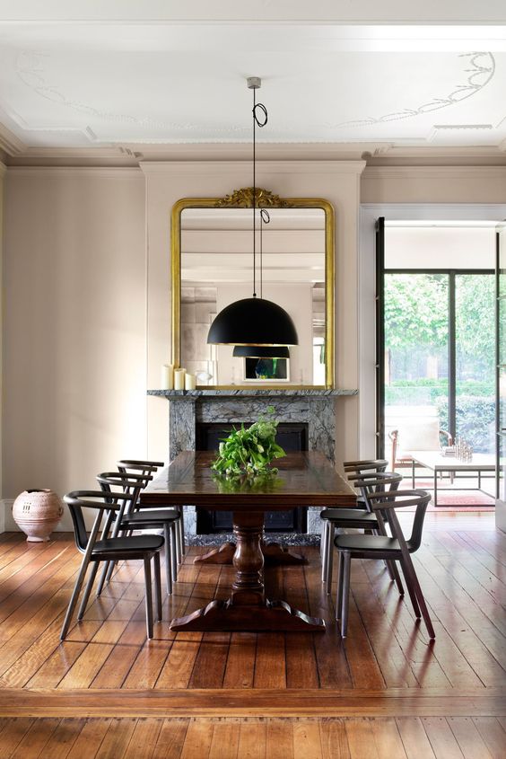
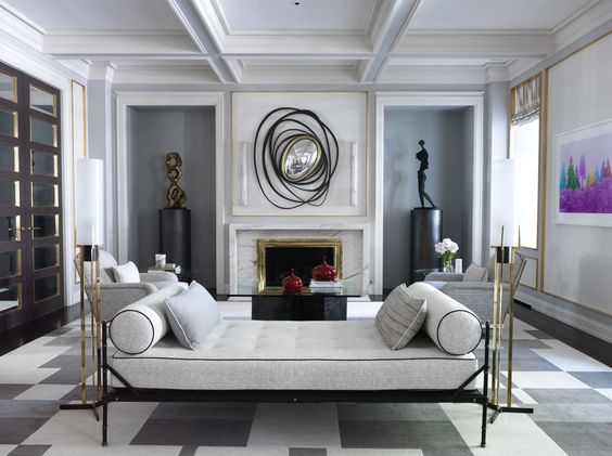
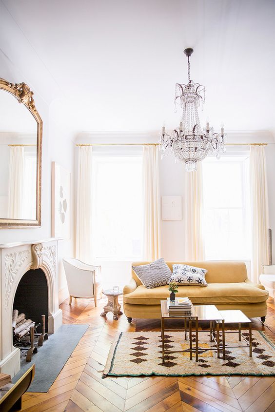
Emphasis is also referred to as a point of focus, or interruption. It marks the location in a composition which most strongly draw the viewers attention. Usually there is a primary or main point of emphasis, with perhaps a secondary emphasis in other parts of the composition. When designing a space, emphasis can be achieved in several ways. Repetition creates emphasis by calling attention to the repeated element through force in numbers. Such as the repetition of the chairs, which they draw the viewer's eye to the fireplace. Or contrast, which achieves emphasis by setting the point of emphasis apart from the rest of its background. It can be represented by the dark tufted and upholstered headboard. Various kinds of contrasts are possible. The use of even the most slight contrast will draw attention towards or away from the point of focus. I like to define one major area in the room as the main point of focus, however when stepping back and looking at the elevations of each wall (because we don't only look at one wall in a room), I also try to determine their individual focal point, because in theory each has its own composition. A focal point can be supported or emphasized by adding texture, pattern, or a prominent object that is perhaps in a contrasting color or larger than everything else, which could be the bed with the drapery and crown in the bedroom image.
UNITY
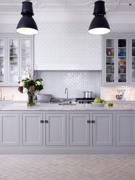
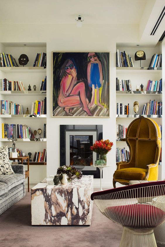
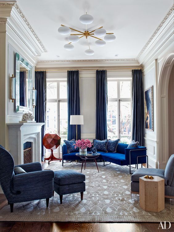
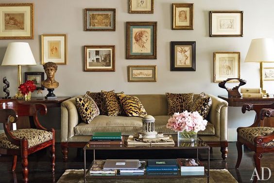
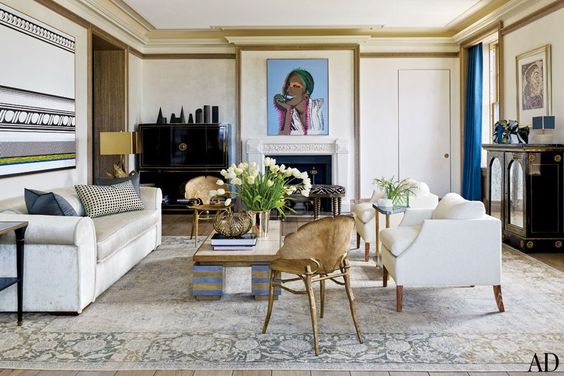
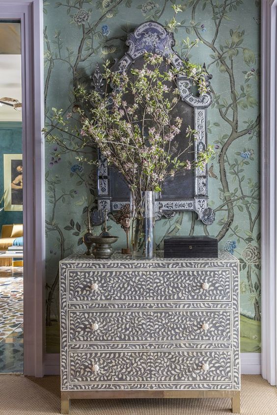
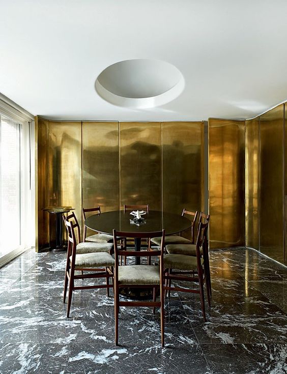
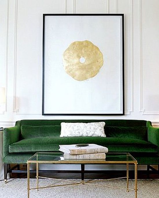
Unity is the underlying principle that summarizes all of the principles and elements of design. It refers to the coherence of the whole, the sense that all of the parts are working together to achieve a common result; a harmony of all the parts. Unity can be achieved through the effective and consistent use of any of the elements, but pattern - that is, underlying structure - is the most fundamental element for a strong sense of unity - see the kitchen above with the tiling. Consistency of form and color are also powerful tools that can pull a composition together. In the second image above, there is color repetition throughout different objects that helps unify the room. Although the furnishings are from different eras and styles, the is a color consistency. This is also seen in the living room with the blue upholstered furniture. Unity also exists in variety. It is not necessary for all of the elements to be identical in form providing they have a common quality of meaning or style. For example, in the last image of the living room designed by Nina Griscom. Many of the elements have the commonality of neoclassical design features and references. Unity can also be a matter of concept. The elements and principles can be selected to support the intended function of the designed room; the purpose of the room unifies the design.
PROPORTION
Proportion is important with the scale of the furniture and items within the space. When creating a space you should reference the relationship between objects, or parts of a whole. As Charlotte Jirousek explains, "our most universal standard of measurement is the human body; that is our experience of living in our bodies." The means we should consider the function of a space. If you're designing for an impressive space, such as a cathedral or center of government, the scale is usually massive and makes the human feel small. Whereas in residential spaces, the scale is usually more in human scale measurement. Making the spaces more comfortable and friendly. To become more detailed about scale, in smaller spaces the proportion of elements should either follow suit or be intentional so that they reflect the size of the space. If you want to emphasize the small, perhaps you bring in larger furniture, in turn if you want to make the space feel more open in a large room, you can use smaller or more petite silhouettes. Also, you can use proportion to create emphasis on a certain object or the focal point of the room.
Proportion should also be considered in scale of pattern. if a pattern is too large for the scale of the room or too small it can feel overwhelming or just the opposite.
Final Thoughts...
Once you have an understanding for how these principals effect the design outcome, you can really start to push and pull the rules according to how you'd like to bend them. I'm a major fan of playing with proportion and scale as well as considering how rhythm and emphasis can effect spaces. For example, sometimes you want the pink elephant in the room to be the center of attention because it's just that great with it's vibrant pink skin that we all know has an amazing texture! Too weird for analogy? I think not. Anything more to add? Tell me!
Sources:
I gathered most of my information from the text by Prof. Charlotte Jirousek of Cornell University


