
Le Tigre Bath Remodel, ORC - Week 3

If you’re new around here, thanks for stopping by and welcome! I am Lauren Caron, an interior designer and the founder of Studio Laloc, an interior design firm based in Seattle, Washington. On the side my husband and I are remodeling our home that I’ve given its own hashtag #ourseattlecraftsman. We’ve renovated our kitchen, scullery and now we’re on to the Powder Room. This is my first foray in participating in the One Room Challenge and I’m really excited to be a guest participant. I hope you stick around and follow along as we make our 70s bathroom into a modern day jewel box! If you missed last week’s post please check out it via the link below!
WEEK 2 POST
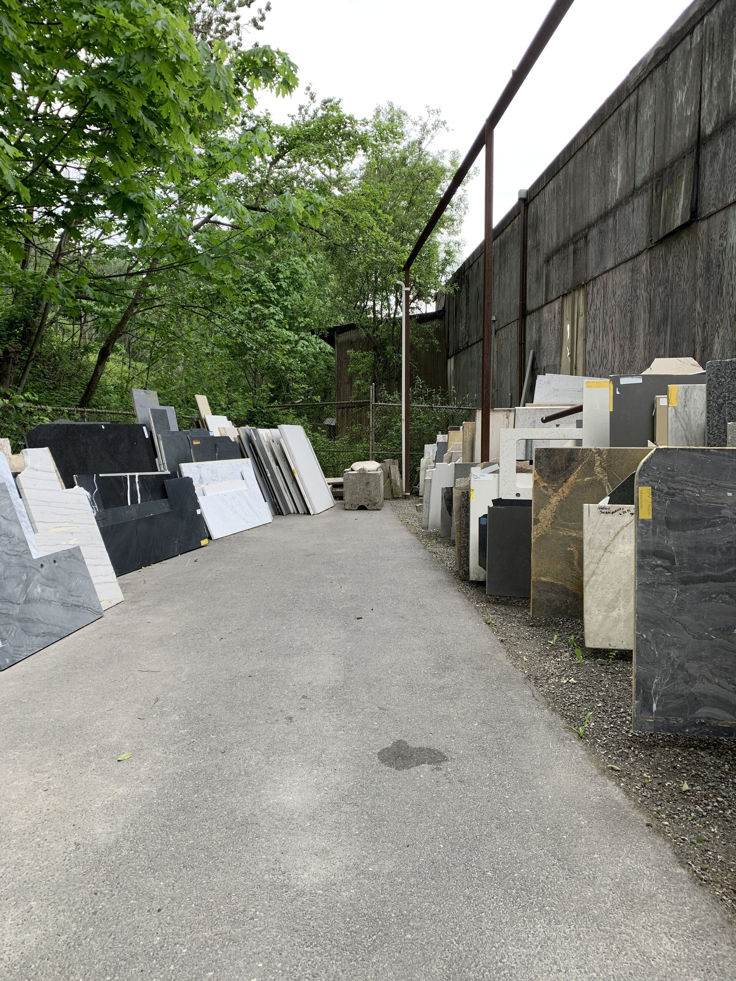
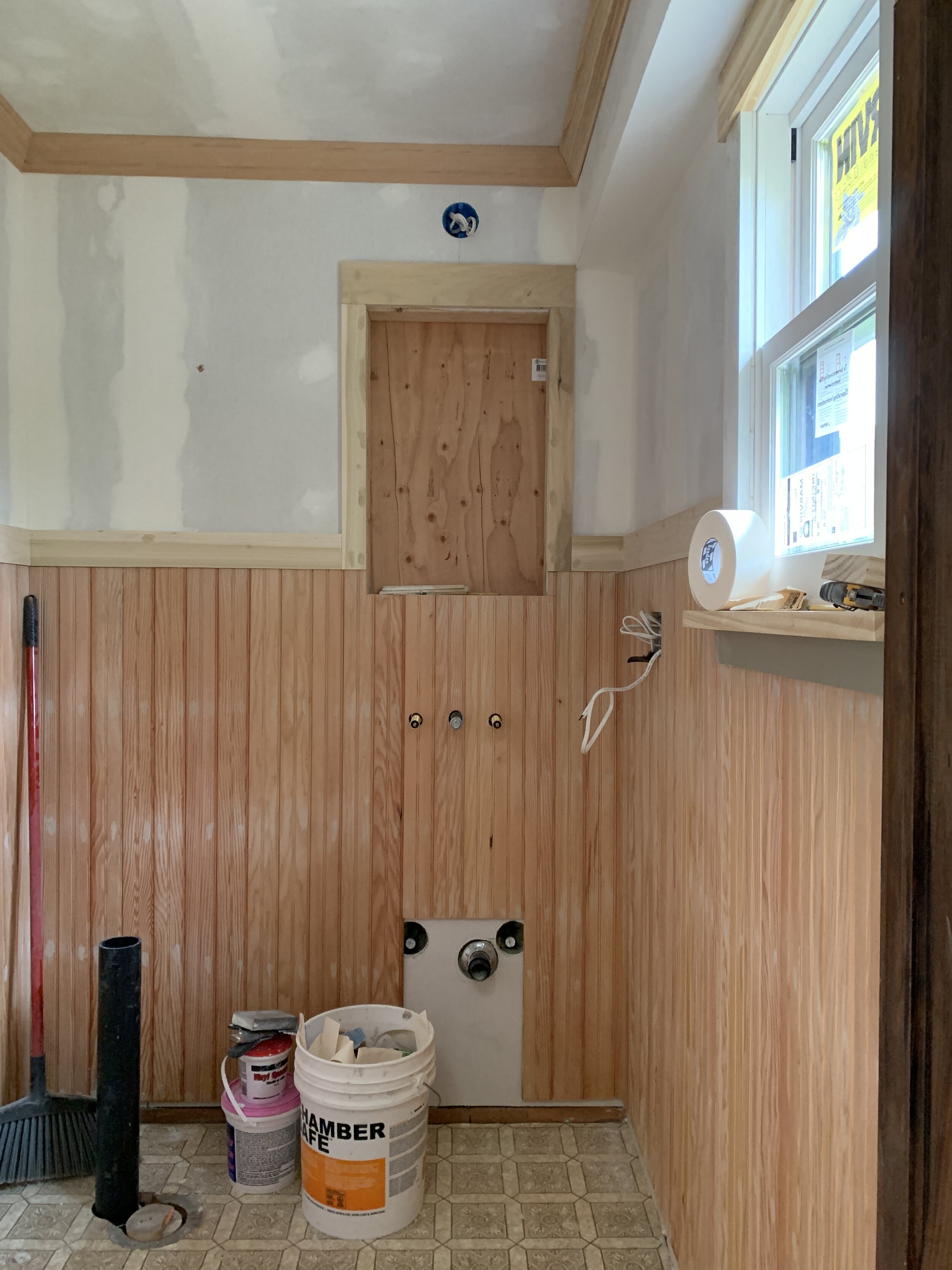
Okay, we’re on week 3 and I’ve managed to get you all up to speed with where we currently are in the remodel. Last week we went to two different stone fabricators to select remnant options for the countertop, as well as selected (and purchased) all of our trim profiles. Jack managed to install all of the crowns, and a portion of the trim to cap the beadboard. While I filled the nail holes, and sanded.
I ordered the window treatment hardware, but I’m still behind on ordering a few other items. I still need to order the paint and finalize the textiles for the curtain, we also need to figure out and finalize the door we’re installing. I may need to order a door or find one at Second Use, our local salvage shop.
The Stone
To recap the stone fabricator visits. The first fabricator I visited had a large selection of remnants. I found a beautiful premium calacatta gold remnant that is a perfect match to my floor tiles, which are calacatta gold as well. When I found that remnant, I was almost positive, that THAT was my slab. Except, that I was a little concerned about the thickness of the slab being only 2 cm.


Stone comes in two thicknesses, 3 cm (1.25”) and 2 cm (.75”). There are advantages and disadvantages to using both thicknesses. 2 cm is often less expensive because you’re paying for less material, it is also better as a backsplash because backsplashes are typically better when they’re slightly thinner. Often if 2 cm looks too thin on a countertop, you can use it like an apron and create an overlay/waterfall edge. The benefits of 3 cm is that it’s great for using it as the thickness it is. It’s less breakable in transport and installation. And if you design it with an edge detail, you’ll see that detail better on 3 cm over 2 cm.
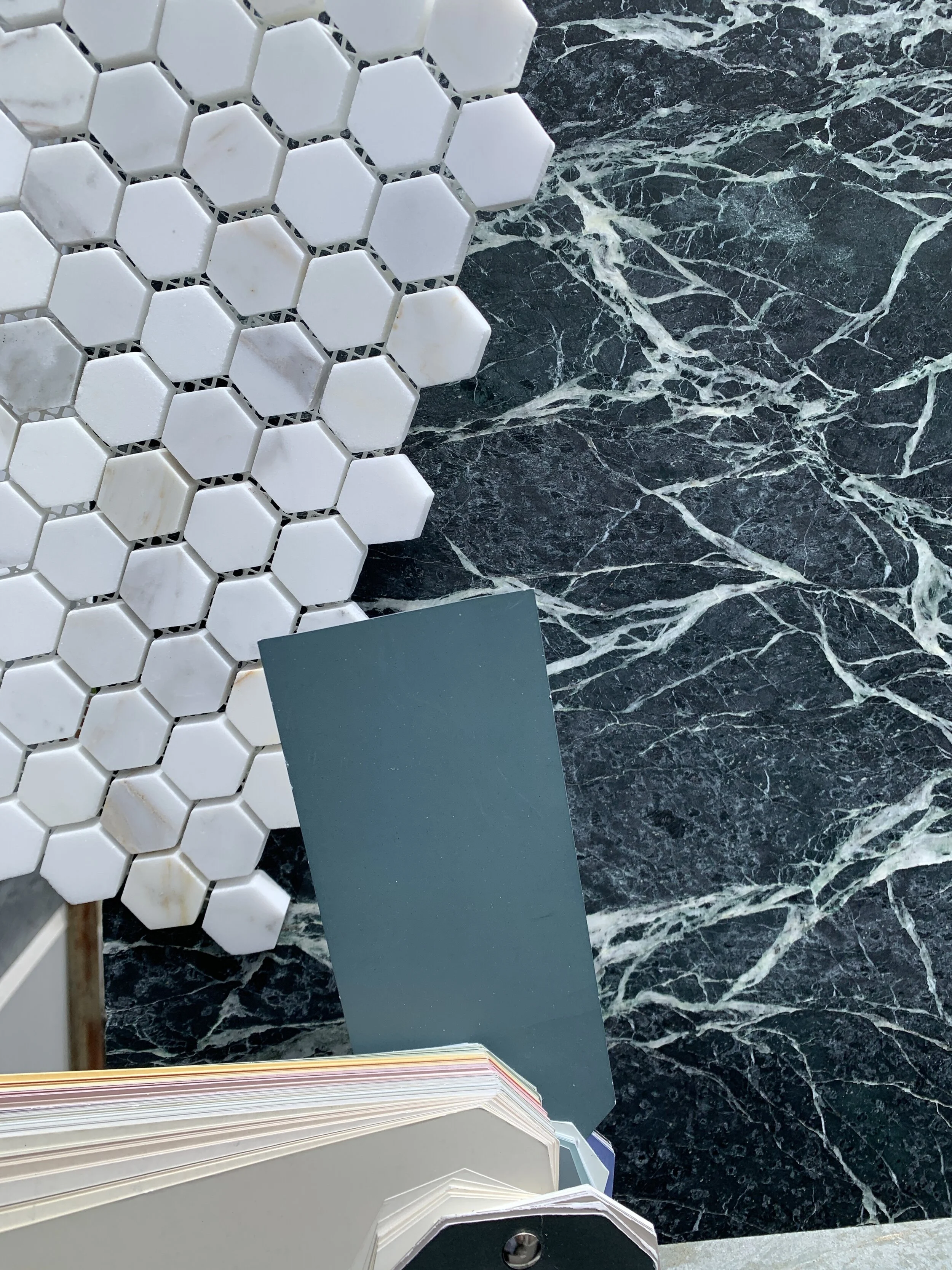


The next day I visited another stone fabricator, and found another option that is also a beautiful stone. This time, completely different. It’s a soapstone remnant that looks like a beautiful serpentine marble with a lot of graining. I believe it is an arabesque soapstone. This slab is 3 cm, so the thickness makes me happy. I prefer the 3 cm, because I’m planning to do an ogee edge on the backsplash. As far as my preference for either look, I honestly don’t have a favorite. I think they’re both beautiful and would work well. I think I’m slightly leaning towards the soapstone, but we’ll have to see when I get the pricing. Which I don’t have for either yet. Once I have the pricing I can make an informed decision about which direction to take.

The Trim Details
On Saturday we quickly selected trim and purchased it. Jack installed the crown and part of the cap for the beadboard trim. When I ordered the medicine cabinet I knew it was going to be a bit of a headache to install with the beadboard, but I also figured we would come up with a solution that we would be be happy with. When we were figuring out the trim placement and detailing, the issues arose pretty quickly. First we realized that the cap detailing of the beadboard would interfere with the frame of the medicine cabinet. Secondly, that the medicine cabinet needs to be flush to the wall entirely around it enough to accommodate the hinge. That meant that we had to build a frame around the medicine cabinet to have it be flush to the beadboard. Also, we will plan on ending the beadboard trim pieces at a 45º angle before they interfere with the frame. This detail would reflect the trim details in our dining room. Pictured below.

I quickly skimmed over the trim we selected in my stories on instagram. If you pop over to the highlights of week 2, you can see how fast we made those decisions. But on here, I’d love to go a little deeper into that decision process.


When we started planning this room I knew I wanted beadboard, but I also knew I wanted wallpaper. So it made sense to make the beadboard act like a wainscoting with a chair rail detail. Because our home is a craftsman and already has paneling in the dining room that is plate rail height, I wanted follow that formula, and set the beadboard height high in the powder room as well. The ceilings in the powder are a foot shorter than in the dining room, so we set the beadboard height in the powder a foot shorter as well. For the trim detailing we followed the dining formula with a flat panel that is slightly proud of the wall paneling, and capped it with a crown and cap piece. You can see how the design in the dining room is similar to the powder, but slightly different in scale. That was intended to make the trim proportional to the space. I would say the profiles we selected for the powder are slightly pre-date craftsman, but they just felt better for the space. I could have been very strict and chose profiles that were more inline with the arts and crafts period, but I don’t think that’s entirely necessary. Also, since other parts of the house have moulding profiles that differ slightly, I felt as though I could slightly break the formula in here as well.

Window Treatments
Changing gears to the window treatments. I had a tough time editing my fabric selections. I began with about 20 samples and managed to edit down to five total and have wavered on the five for quite a while. I think I may end up going with whichever one I can purchased at a low minimum and is in stock…that sounds like a sad way to make a decision, but honestly I’d be happy with any of the selections so I need to be realistic and order based on budget and timeframe. In terms of why I’ve narrowed it down to these five options? Well here’s a little background as to why I like each.

Option 1 - Ticking Stripe
The ticking stripe is the most neutral and simple design. The scale is great, and it will definitely look good, but not stand out amongst the rest of the room. Which is completely fine. Not everything has to be strong and bold, especially in a small space like this.

Option 2 - Floral
This fabric leans the most traditional of the selections I have maybe aside from the check or stripe. I love the way the color of the deeper blue/gray/green leaves look with the wall color. I also love the scale, and the background color is very similar to the wallpaper ground color. This one is a little more interesting than the stripe, but still also kind of subtle.

Option 3 - Checked
I love a good checked fabric and have it planned in several areas of my home. So this seemed like a no brainer, especially since it is so similar to the wall color. The only thing though, is that I’m also planning to use a check in my dining, the almost next room over. Is that too much check? Not sure. As for the scale, it’s great.
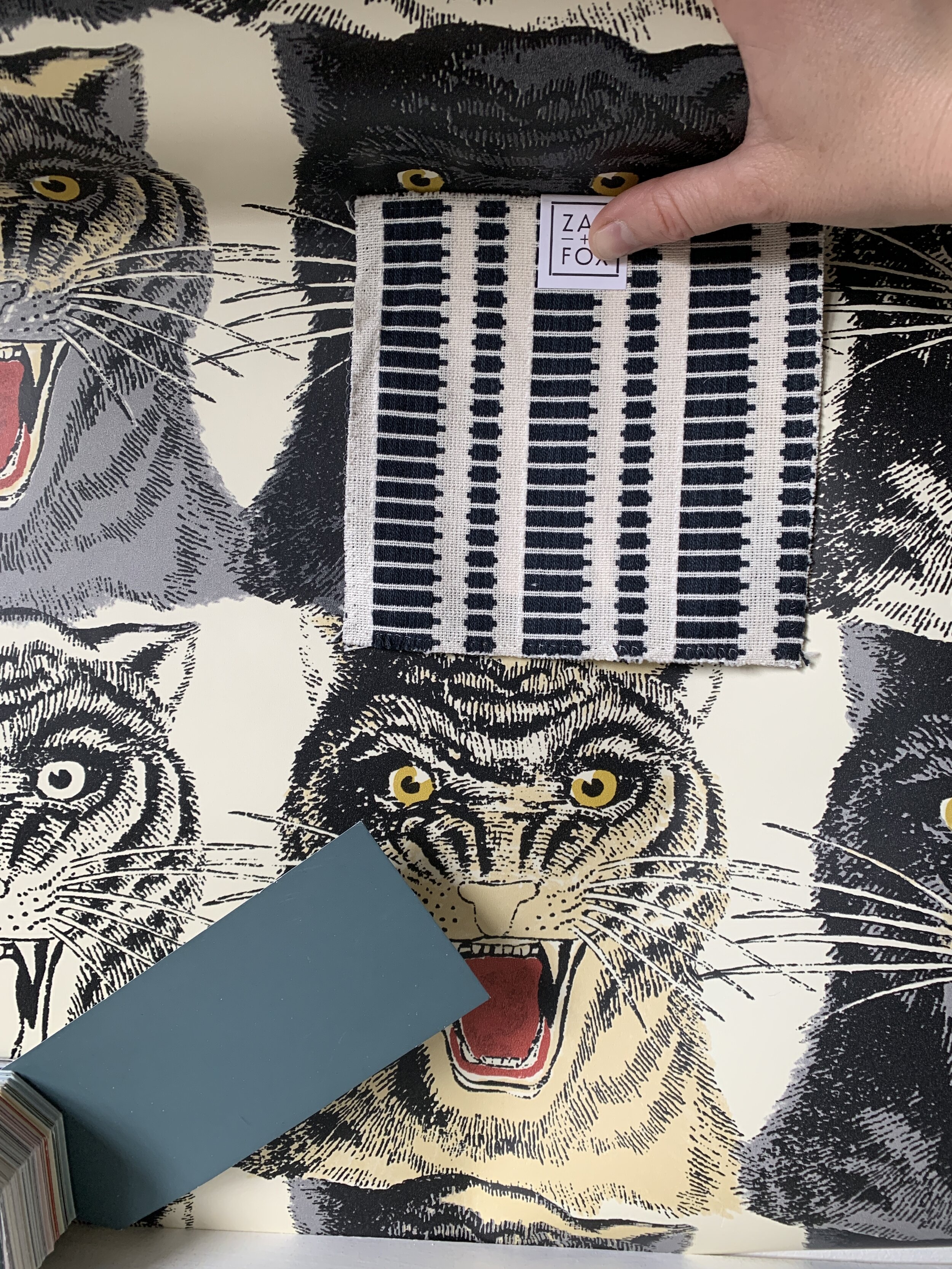
Option 4 - Modern Stripe
This stripe is not exactly a stripe but reads as one and the colors are great. I like how it kind of reads like bold thick hatches and references the hatch lines of the wallpaper. The ground is similar to the wallpaper and the dark stripe protions are somewhere between a blue and charcoal. Sometimes they read blue, sometimes charcoal. I really like this option, because it’s different. It’s a little bolder than the other choices, yet still works with the scale and is quite neutral in palette.

Option 5 - The Colorful Stripe
I love this fabric because it has all the colors of the wallpaper in it, plus a pink ground! It’s unexpected for sure. and may be too much, but I’m also not entirely sure it will be? My only concern is that it has silk in it, which makes it quite a fancy textile, and I am not planning to line it. So I have concerns that it will fade.
So, what will I choose? Do you have a favorite?
The To Do List
Demo Bathroom - Complete
Remove Pebble Dash from Walls - Complete
Reset plumbing to accommodate new fixtures and design - Complete
shift toilet waste pipe over 3” - Complete
Set electrical placement of overhead light fixture, wall sconce, plugs and switches - Complete
Remove existing window and swap with new - Complete
Create inset for medicine cabinet - Complete
Install insulation - Complete
Sheet rock walls and ceilings - Complete
Mount tongue and groove beadboard paneling - Complete
Set trim around window - Complete
Mud seams and smooth coat over sheetrock - Complete
Fill nail holes in beadboard - Complete
Prime walls & ceiling
Order door
Order paint
Finalize window treatments & order fabric
Install floor tiles
Install door
Install baseboards and trim
Paint paneling, trim & ceiling
Install medicine cabinet
Wallpaper above paneling
Modify vanity cabinet drawers to accommodate sink & plumbing
Install plumbing fixtures
Install countertop and backsplash
Install hardware fixtures - toilet paper holders, towel holders, etc.
Photograph room
Wow, we have a lot to accomplish. I’m really stressing out about getting my tiling person in. I think we may have to tile the floors ourselves. Which I DO NOT want to do!
Remember to check out the other One Room Challenge Participants and to follow along on Instagram! And to check out Better Homes & Gardens who has partnered up with ORC as this year’s media sponsor.


